
Search for hygge decorating ideas and you will find room after room of white walls, oatmeal throws, and pale wood. Those rooms can be lovely, but they can also leave you wondering whether your green sofa, your patterned quilt, or your shelf of colorful books disqualifies you from the whole idea. It does not.
Hygge is a feeling of comfort, warmth, and welcome, and color can create that feeling just as well as beige can. A deep teal reading chair, a terracotta lamp, a stack of quilts in faded reds and blues, or a mustard throw on a navy sofa can all make a room feel like somewhere you want to stay. The trick is knowing how to bring color in so it feels cozy and collected instead of loud or chaotic.
I am not a neutral person, but for a long time I decorated like one because I was afraid of getting color wrong. As I have started intentionally bringing more hygge into our home, I have been learning that color is not the risk I thought it was. This guide walks through where color can live in a home, how to mix it, and how to keep it feeling warm and calm, so you can build a cozy home in the colors you love.
TL;DR: How to Create a Colorful Hygge Home Without Going Neutral
Colorful hygge is a cozy home that uses real color instead of an all-neutral palette. It works when color comes from things you love, lives in layers like textiles, pattern, painted pieces, and art, and is grounded by wood, warm neutrals, breathing room, and warm lighting. Start small, build around what you already own, and let your home look like the people who live in it.
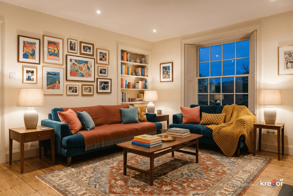
Colorful Hygge at a Glance
- Know why hygge was never only neutral: the beige version is one interpretation, not the rule.
- Learn what makes color feel cozy: warmth, depth, and repetition separate a welcoming room from a chaotic one.
- Start with what you already love: collections, art, books, and heirlooms can set a room’s colors.
- Let textiles carry the color: blankets, rugs, pillows, and curtains are the easiest place to begin.
- Use pattern to tie colors together: quilts, florals, plaids, and rugs coordinate colors for you.
- Paint beyond the walls: furniture, doors, ceilings, and built-ins can all hold color.
- Bring in color through art and meaningful objects.
- Ground it so it stays cozy: wood, warm neutrals, breathing room, and warm light keep color calm.
- Give each room its own color story.
- Make peace with the fear of color.
Why Hygge Was Never Only Neutral
Hygge describes a feeling, not a color scheme. The white-and-beige look many of us associate with it comes mostly from a popular version of Scandinavian style, and Scandinavian homes themselves have a long, colorful history that the stereotype leaves out.
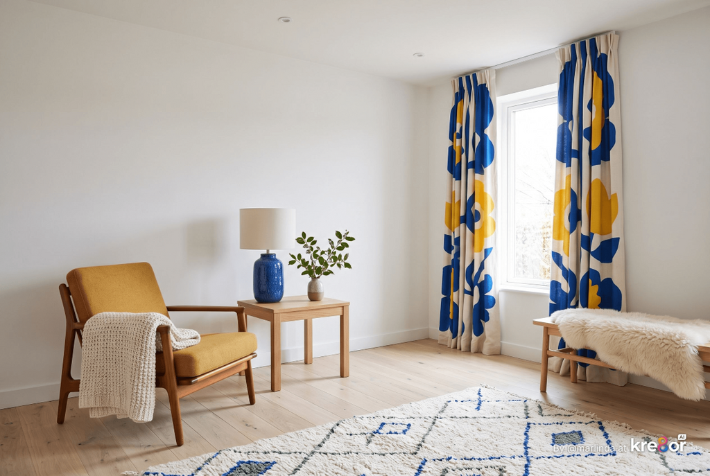
Where did the idea of neutral hygge come from?
When hygge became an international trend around 2016, it was usually pictured through minimalist Scandinavian interiors, which helped cement the idea that Nordic homes are all pale woods and neutrals. White walls do have a practical root in the region, where long, dark winters make bouncing light around a room valuable, but neutrals were never the definition of hygge itself.
Meik Wiking, who leads the Happiness Research Institute in Copenhagen and wrote The Little Book of Hygge, describes hygge as an atmosphere and an experience. He has also pointed out that furniture and lamps are only outward signs of it, and that anything too pretentious or expensive works against it. In other words, hygge was never about owning the right things in the right shades.
Scandinavian design history backs that up. Mid-century Nordic interiors embraced strong colors and bold graphic prints, and many people in the region still see that burst of color as part of their design heritage. The all-neutral version is one interpretation that photographs beautifully, not the only correct one.
That matters if your home is full of color, or if you have always wanted it to be. Your red armchair and your shelf of mismatched pottery are not obstacles to hygge. They might be the very things that make your home feel like yours.
Highlights
- Hygge is a feeling: comfort, togetherness, and a sense of being at home matter more than any specific color.
- The neutral look is one style: it grew popular alongside minimalist Scandinavian design, especially after hygge became a trend.
- Scandinavian homes have colorful roots: bold mid-century color and pattern are part of the region’s design story.
- Your belongings count: colorful objects you love can add to hygge rather than take away from it.
Homey Hygge Tip
Walk through your home and notice the spot where you naturally settle when you want to relax. Look at the colors around you there. That favorite corner often tells you more about the palette that feels cozy to you than any inspiration photo will.
Color That Feels Cozy vs. Color That Feels Chaotic
Color feels cozy when it is warm or softened, repeated with intention, and balanced with places for the eye to rest. It feels chaotic when every color competes at full strength, nothing repeats, and every surface is filled.
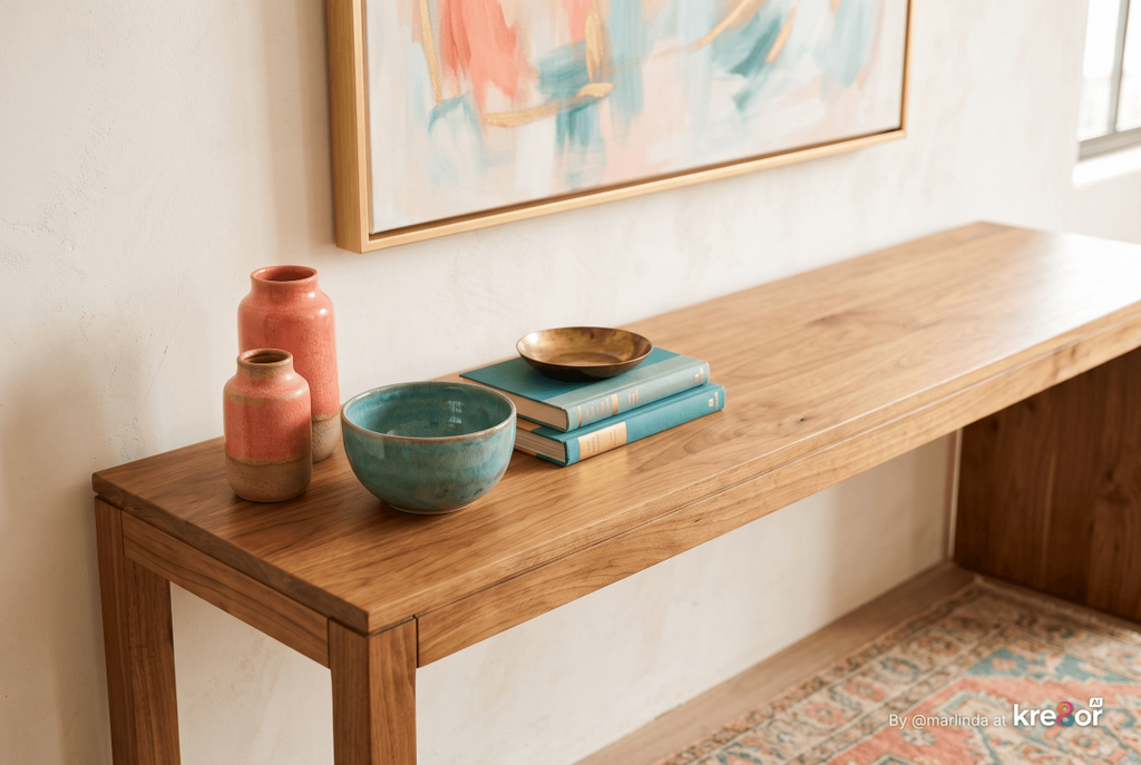
Can a colorful room still feel calm?
Yes. A colorful room feels calm when its colors share a similar warmth or depth, show up in more than one place, and sit alongside calm elements like wood, solid fabrics, and open surfaces. Calm comes from how the color is arranged, not from how little of it there is.
Most of us have been in a room with lots of color that felt wonderful, and in another with the same amount that felt exhausting. The difference usually comes down to three things: the character of the colors, how they repeat, and how much breathing room surrounds them.
Colors with a little depth, like rust instead of bright orange or teal instead of electric blue, tend to feel more grown-up and restful. That does not mean every color must be muted. A cheerful yellow or a bright coral can absolutely be cozy when it is supported by calmer colors and natural materials.
Repetition is what makes color look intentional. When the green in a pillow shows up again in a painting and a vase across the room, your eye connects them and the room feels pulled together. A color that appears only once can look like an accident.
Breathing room is the final piece. Homey Hygge is layered, not minimalist, but cozy does not mean cluttered. A few colorful pieces with space around them will always feel warmer than color crowded onto every surface. For specific color combinations and how to balance proportions, our guide to The Best Hygge Color Palettes for a Cozy Home goes deeper.
Cozy Color Checklist
- Warmth or depth: colors with a touch of red, yellow, brown, or gray usually feel softer than icy or neon versions.
- Repetition: each main color appears in at least a couple of places around the room.
- A clear lead: one color or color family is in charge, and the others support it.
- Calm surfaces: solid fabrics, plain walls, or wood give colorful pieces room to stand out.
- Warm lighting: evening light should make your colors glow rather than look flat.
Homey Hygge Tip
Take a photo of your room and look at it in black and white on your phone. If everything reads as the same gray, the room may need more contrast between light and dark. If the photo looks busy even without color, the room probably needs more calm surfaces or fewer objects.
Start With What You Already Love
The easiest way to choose colors for a cozy home is to borrow them from things you already treasure. A favorite painting, a collection of vintage pottery, a quilt from a grandmother, or a row of well-loved books already holds colors that mean something to you.
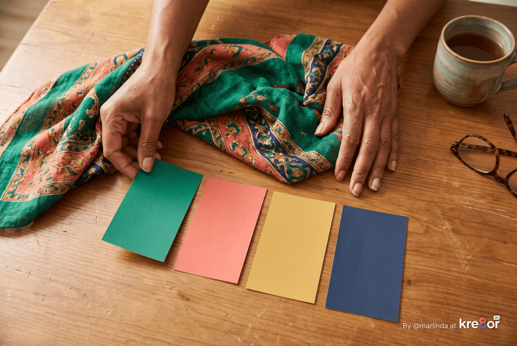
How do I choose colors for my home if I don’t know where to start?
Pick one object you love that has several colors in it, such as a rug, a scarf, a piece of art, or a quilt, and use it as your guide. Pull your main color from the largest area of the object and your accents from the smaller details.
Colors chosen this way feel personal from the start, because they come from your own history instead of a trend report. They also tend to work together naturally, since the artist, weaver, or maker already did the hard work of balancing them.
This approach also helps you avoid one of the most common decorating traps: buying a room’s worth of new things in a fashionable palette and ending up with a space that looks nice but feels like it belongs to someone else. Building around what you love keeps your home recognizably yours.
Look beyond the obvious, too. The colors in a travel souvenir, a child’s drawing, a cookbook cover, or even a favorite mug can become the starting point for a whole room.
Places to Find Your Colors
- Art and prints: a painting or poster you love is often a ready-made palette.
- Textiles you have kept for years: quilts, scarves, and vintage rugs reveal colors you return to.
- Collections: pottery, glassware, books, or records add color that tells a story.
- Heirlooms and travel finds: family pieces and souvenirs connect color to memories.
- Your closet: the colors you wear most often are usually colors you are comfortable living with.
Homey Hygge Recommendation
Place your inspiration object somewhere you will see it every day while you plan the room, such as on a mantel, console, or nightstand. Living with it for a week or two helps you notice which of its colors you are drawn to most, before you spend money on anything new.
Let Textiles Carry the Color
Textiles are the easiest, most affordable, and most forgiving way to bring color into a cozy home. Blankets, rugs, pillows, curtains, and bedding add color and comfort at the same time, and they are simple to swap when your taste or the season changes.
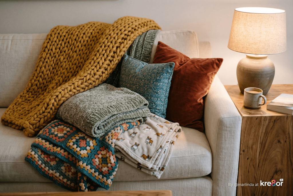
What is the easiest way to add color to a neutral room?
Start with textiles. A colorful throw, a pair of patterned pillows, or a new rug can change the whole feeling of a neutral room in an afternoon, with no paint and very little commitment.
Textiles are where coziness and color meet. They are the things you touch, wrap yourself in, and sink into, so choosing them in colors you love makes a room feel welcoming in a very physical way. Wool, chenille, velvet, linen, and cotton each hold color differently, which adds depth even within a single shade.
In our home, blankets do a lot of this work. I always have a few big, soft ones within reach, and because I am tall, I look for long throws that actually cover me. Some are chunky knits, some are chenille or crochet, and a few have fun designs like dogs or coffee mugs. They add color, texture, and personality without asking me to commit to anything permanent.
Rugs deserve special attention because they cover so much visual space. A colorful or patterned rug can anchor an entire room and give you a palette to build on. Curtains work in a similar way, framing windows with color while softening the room.
Textiles That Add the Most Color
- Area rugs: the largest textile in most rooms and a natural foundation for a palette.
- Throws and blankets: easy to layer, easy to swap, and wonderful for adding seasonal color.
- Pillows: small, inexpensive ways to repeat colors around a room.
- Curtains: add height and color while softening hard edges.
- Bedding and quilts: turn a bed into the main color moment in a bedroom.
- Upholstery: a colorful chair or sofa makes a lasting statement.
Homey Hygge Tip
If you are nervous about a bold color, try it first in a throw or blanket. Drape it over your sofa or bed for a week and notice how often you reach for it and how the room feels in the evening. If you love it, that color has earned a bigger role.
Use Pattern to Tie Colors Together
Pattern is one of the best tools for colorful hygge because it combines several colors in a way that already works. A good quilt, floral fabric, plaid, or rug can coordinate a room’s colors for you, then smaller patterns and solids can build around it.
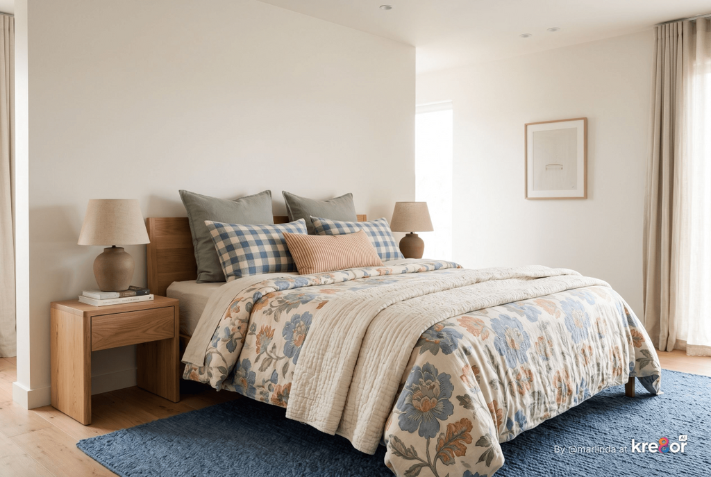
How do I mix patterns without making a room feel busy?
Vary the scale and repeat at least one color. Pair one large pattern with medium and small ones, make sure they share a color or two, and use solid fabrics in between so each pattern has room to breathe.
Patterns of the same size tend to compete, which is what makes a room feel busy. Designers often start with one large-scale pattern, then add a medium or smaller pattern that shares some of its colors, and finally a stripe, check, or subtle texture. Each layer supports the others instead of fighting for attention.
Solid colors are the quiet heroes of pattern mixing. A solid sofa beneath patterned pillows, or a plain wall behind a patterned chair, gives the eye a place to rest. Without those breaks, even beautifully coordinated patterns can start to feel crowded.
Traditional patterns are especially cozy. Quilts, florals, paisleys, plaids, ikats, and kilim rugs often carry a sense of history and comfort, and they tend to mix well because many of them grew out of similar color traditions.
Pattern Pairing Guide
- One large pattern: a rug, curtains, wallpaper, or a statement chair sets the tone.
- One medium pattern: pillows or a throw that share a color with the large pattern.
- One small pattern or stripe: a ticking stripe, check, or small floral adds detail.
- Solids in between: plain upholstery, walls, or bedding keep the mix from feeling crowded.
- A shared color: at least one color should appear in every pattern to tie them together.
Homey Hygge Recommendation
Before buying patterned pieces, lay fabric samples, pillows, or throws you already own on the floor or sofa together and step back. Photograph the arrangement and look at it later. It is far easier to spot a pattern that competes when you see everything side by side.
Paint Beyond the Walls
Paint does not have to cover four walls to make a room colorful. A painted dresser, front door, ceiling, staircase, kitchen island, or the inside of a bookcase can bring in rich color with far less commitment than repainting a whole room.
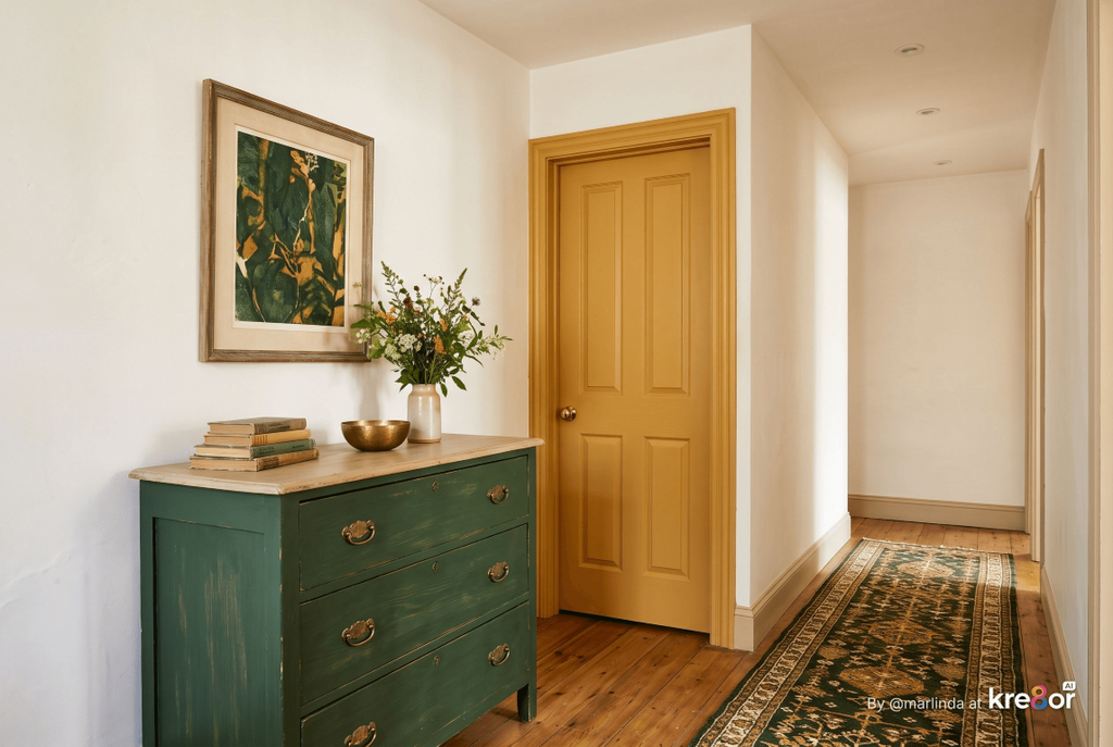
What is a painted ceiling, and does it make a room feel cozy?
Designers often call the ceiling the fifth wall, and painting it a color instead of standard white can make a room feel more enclosed and intimate. Because ceilings receive less direct light, a color usually looks darker overhead than on the walls, so many designers choose a lighter or softened version of the wall color for the ceiling.
Smaller painted surfaces are often the best way to experiment. A thrifted side table painted deep green, a bedroom door in warm ochre, or a hallway bench in soft coral can become a bright spot that makes you smile every time you pass it. If you change your mind, repainting a single piece is a weekend project rather than a renovation.
Built-ins and cabinetry are another natural home for color. Painting the back of open shelves, a kitchen island, or bathroom cabinetry gives a room depth and personality while the walls stay calm. It also makes everyday objects like dishes and books look more deliberate.
If you are ready for something bigger, color drenching takes one color, or very closely related shades, across the walls, trim, doors, and sometimes the ceiling. Done in a warm, softened color, it can make a small room such as a den, powder room, or reading nook feel wonderfully wrapped and cozy.
Easy Places to Paint
- Furniture: dressers, side tables, chairs, and benches are small, low-risk projects.
- Doors: interior doors and front doors add color without touching the walls.
- Shelving and built-ins: paint the backs of bookcases or cabinet interiors.
- Kitchen islands and cabinetry: a colored island grounds a kitchen with personality.
- Ceilings: a softened color overhead makes a room feel more intimate.
- Trim and window frames: a contrasting or tonal trim color adds subtle detail.
Homey Hygge Tip
If you are considering a painted ceiling, paint a large sample board and hold it overhead in the room at different times of day. Ceiling color can look noticeably darker than expected, and seeing it in place helps you decide whether to soften it.
Bring in Color Through Art and Meaningful Objects
Art and personal objects are some of the most meaningful ways to bring color into a hygge home. Paintings, prints, family photographs, ceramics, books, and collected treasures add color that also tells a story about who lives there.
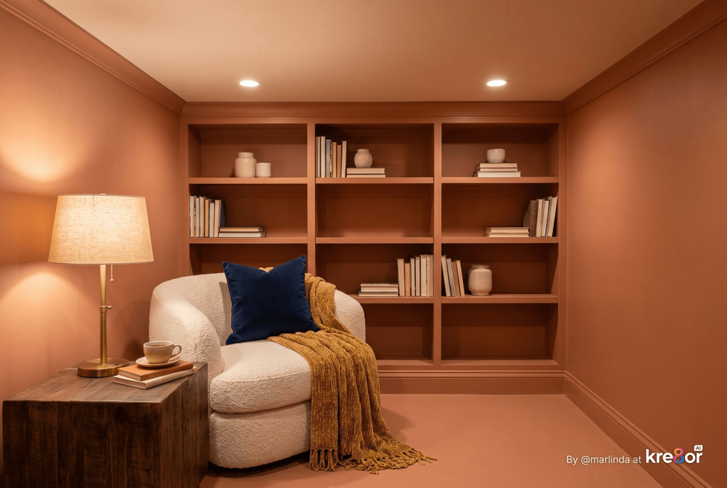
How can I add color without buying new decor?
Shop your own home first. Gather colorful books, pottery, framed art, textiles, and keepsakes from closets, shelves, and storage, then group them in a few places where they can be enjoyed instead of scattering them everywhere.
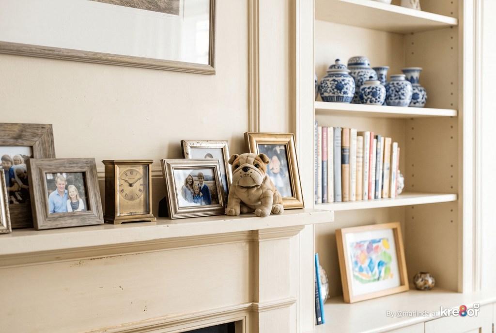
Colorful objects feel cozy when they mean something. A shelf of cookbooks with faded spines, a grouping of blue-and-white dishes, a child’s watercolor in a simple frame, or pottery collected on trips all bring color and warmth in a way mass-produced decor rarely does.
This is also where personality and a little playfulness can come through. I happen to love a cute stuffed animal tucked onto a mantel or shelf, which is exactly the kind of detail a decorating rulebook might say to remove. In a hygge home, small things that make you happy have every right to stay.
Grouping matters more than quantity. Collections look intentional when they are gathered together, such as books stacked by color on one shelf or a cluster of frames on one wall, rather than spread thinly across every surface.
Ways to Display Colorful Objects
- Gallery walls: group art and photographs with a shared color or frame finish.
- Collections on one shelf: pottery, glassware, or books look stronger together.
- Rotating displays: swap seasonal or sentimental pieces in and out of a console or mantel.
- Books as decor: stacks of colorful books add instant warmth to tables and shelves.
- Everyday items: colorful dishes, mugs, and tea towels can be on display and still be used.
Homey Hygge Recommendation
Choose one wall or shelf to become a display that you change a few times a year. It gives you a place to enjoy colorful treasures without crowding every room, and it keeps your home feeling fresh without buying anything new.
Keep It Cozy With Grounding Elements
Color stays cozy when it is supported by calm, natural elements. Wood, warm neutrals, natural fibers, breathing room, and warm lighting give colorful pieces a steady background so the room feels inviting instead of overwhelming.
What colors go with bold colors to make a room feel cozy?
Warm neutrals such as cream, ivory, and warm white, along with natural wood tones, pair beautifully with bold colors and give them room to shine. Materials like linen, wool, leather, rattan, and brass add warmth without competing.
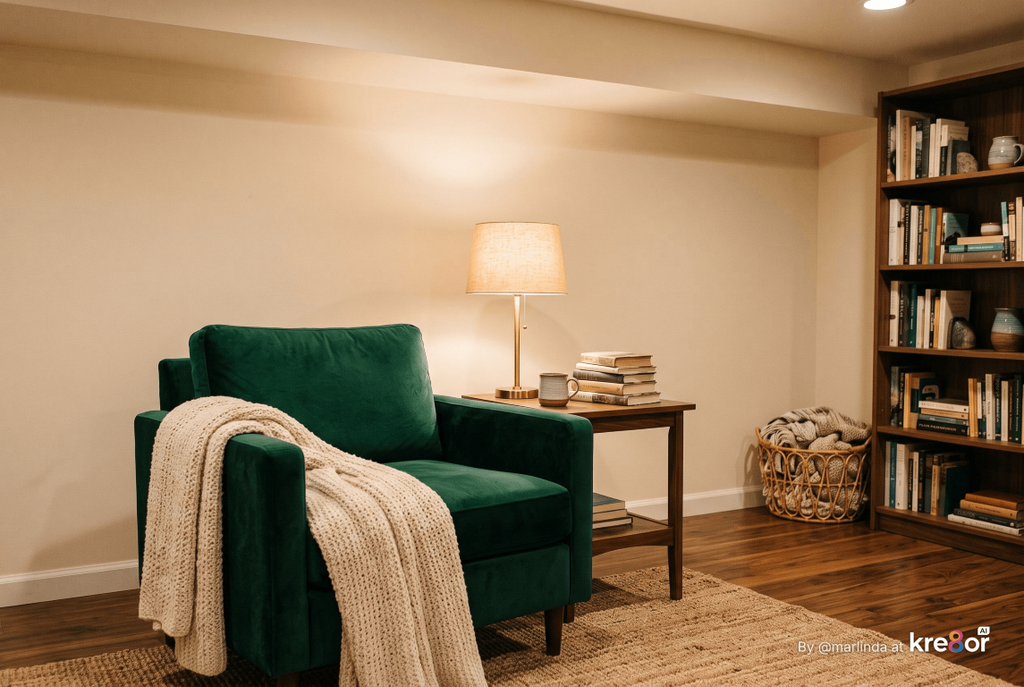
Grounding elements act like a frame around your colors. Medium-toned wood floors and furniture, a cream wall, or a natural jute rug let a teal sofa or a mustard chair stand out while keeping the room warm and settled. Without them, color can start to feel like it is floating with nothing to hold it in place.
Lighting is just as important. Warm white bulbs help colors glow in the evening, while cool or harsh light can make even lovely colors look flat. In our home, I rely on recessed lights overhead and lamps with built-in dimmers and color-adjustable smart bulbs on larger side tables and nightstands, so I can warm the light up as evening settles in. For more on layering light, our guide to Hygge Lighting: How to Create a Warm, Cozy Glow at Home covers the full system.
Finally, leave some space. A colorful home still needs places for the eye to rest, such as an open stretch of wall, a cleared table, or a shelf with a little room on it. Those quiet spots are what make the colorful ones feel special.
Grounding Elements to Lean On
- Natural wood: floors, tables, frames, and shelves warm up every color around them.
- Warm neutrals: cream, ivory, and warm white walls or upholstery calm a colorful room.
- Natural fibers: jute, wool, linen, and cotton add texture without competing.
- Metals with warmth: brass and aged gold catch the light and complement most colors.
- Warm lighting: layered lamps with warm bulbs make color feel cozy in the evening.
- Open space: clear surfaces and breathing room keep color from feeling crowded.
Homey Hygge Tip
If a colorful room suddenly feels like too much, remove a few small objects before you change any colors. Clearing a tabletop or shelf often restores calm faster than repainting, and it shows you which colorful pieces truly earn their place.
Give Each Room Its Own Color Story
Every room can have its own colors as long as something connects them, such as a shared wood tone, a repeated neutral, or one color that travels through the house. Thinking about how each room is used helps you decide how bold or soft its colors should be.
Should every room in a colorful home match?
No. Rooms feel more personal when each has its own character, but the home flows better when they share a common thread. Repeating a wood finish, a trim color, or one accent color from room to room keeps the house feeling connected.
A living room where people gather can handle more energy than a bedroom meant for rest. A kitchen can be cheerful, while an entryway can make a strong first impression in a small space. Matching each room’s colors to how you want to feel there is one of the simplest ways to make color feel right.
It also takes pressure off. You do not need one perfect palette for the entire house. You can try deep green in the den, soft blue in the bedroom, and sunny yellow in the kitchen, then let wood, warm neutrals, and a few repeated accents tie them together.
Color Stories by Room
- Living room: a place for richer color and pattern, such as a teal or rust sofa, a patterned rug, colorful books, and layered throws.
- Bedroom: softer, restful color like dusty blue, sage, blush, or warm gray-green, with color concentrated in bedding and quilts.
- Kitchen and dining: cheerful color that lifts everyday routines, such as a painted island, colorful dishes on open shelves, or patterned seat cushions.
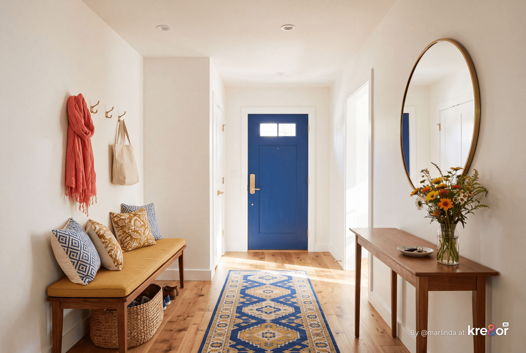
- Entryway: a small space where a bold choice like a painted front door, a patterned runner, or a colorful bench makes a warm welcome.
- Bathroom: a good place to try color drenching or patterned tile, since the room is small and used in short visits.
- Reading nook or den: deeper, enveloping colors such as forest green, navy, or terracotta make a corner feel tucked away.
Homey Hygge Recommendation
Choose one thread to carry through your whole home before you plan individual rooms. It might be warm wood furniture, ivory trim, or one accent color like mustard or teal. With that thread in place, you can give each room its own personality without the house feeling disjointed.
Making Peace With the Fear of Color
Fear of color usually comes from worrying about making an expensive mistake or ending up with a room that looks dated or childish. Starting small, building on what you love, and testing color in your own home turns color from a gamble into a series of small, reversible steps.
How do I get over my fear of using color at home?
Begin with something easy to change, like a throw, pillows, a piece of art, or a painted side table. Live with it for a few weeks, notice how it makes you feel, and add more only once that color starts to feel like yours.
I understand this fear well. For the longest time, I was afraid to add color to my home, so I stuck with what felt safe. Purple is the color I kept coming back to, and as I have started bringing more hygge into our home, I have been letting it lead. That is my color story, and it should not be yours unless you love it too.
What helped me most was realizing that tasteful color is less about which colors you pick and more about how you use them. A room with colors you love, repeated with intention and balanced with warm wood and quiet spaces, will almost always feel more like home than a room decorated to avoid mistakes.
The goal is not to be bold for the sake of being bold. It is to stop hiding the colors that make you happy. Whether that means one emerald velvet pillow or a fully color-drenched den, your home should look like the people who live in it.
Small First Steps
- Add one colorful throw or blanket to the room you use most.
- Swap pillow covers for a color you have always loved but never used.
- Frame a colorful print and hang it where you will see it every day.
- Paint one small piece of furniture, a door, or the back of a bookcase.
- Bring out a hidden collection of colorful books, dishes, or pottery.
Homey Hygge Tip
Keep a note on your phone of colorful rooms, objects, and combinations that catch your eye over a month or two, whether in a café, a museum, a store, or a friend’s home. Patterns will appear quickly, and those repeated favorites are a much better guide to your own color story than any single trend.
Colorful Hygge FAQs: Adding Color to a Cozy Home
Can hygge be colorful?
Yes. Hygge is a feeling of comfort, warmth, and togetherness, not a specific color palette. Colorful rooms can be every bit as cozy as neutral ones when the colors feel warm, repeat with intention, and are balanced with natural materials and warm lighting.
What is colorful hygge?
Colorful hygge is a cozy, welcoming home that uses real color instead of an all-neutral scheme. It combines the comfort and warmth of hygge with colors, patterns, and personal objects that reflect the people who live there.
How do I add color to my home without it looking cluttered?
Repeat a few colors in several places instead of adding many different ones, group colorful objects together rather than scattering them, and leave open surfaces and solid fabrics as resting places for the eye. Cozy and layered does not have to mean crowded.
Are bright colors hygge?
They can be. Bright colors feel cozier when they are used in smaller doses, surrounded by warm neutrals and wood, and lit with warm bulbs in the evening. Deeper or slightly softened versions of a bright color are often easier to live with in large areas.
Do I have to paint my walls to have a colorful home?
Not at all. Textiles, art, collections, painted furniture, rugs, and curtains can make a home feel colorful even with neutral walls. Many people start that way and paint later once they know which colors they love living with.
What is the easiest first step toward a more colorful home?
Add a colorful throw, blanket, or set of pillow covers to the room you use most. Textiles are inexpensive, easy to change, and give you a quick sense of how a color feels in your own space.
Let Your Home Look Like You
A cozy home does not need to be beige to be calm, and it does not need to be bold to be brave. Colorful hygge is simply a home where the colors you love are allowed to show up, supported by warm wood, soft textiles, good light, and enough breathing room to let everything feel settled.
Start with one blanket, one painted piece, or one collection brought out of storage, and build from there at your own pace. The goal is a home that is comfortable enough to relax in, personal enough to recognize yourself in, and colorful in exactly the way that feels right to you.
Continue Creating Your Homey Hygge Home
Once you know you want more color, the next step is choosing which colors belong together. Read The Best Hygge Color Palettes for a Cozy Home for seven cozy color combinations, how to balance them, and how to test colors in your own light.