The Best Hygge Color Palettes are the ones that you enjoy. For the longest time, I was afraid to add real color to my home. I loved it in other people’s rooms and in magazine spreads, but when it came to my own walls, sofas, and bedding, I kept choosing whatever felt safest. If you have ever held a paint swatch you adored and then quietly put it back, you know exactly what I mean.
Purple is my color, and as I have started intentionally bringing more hygge into our home, I have been letting it lead. What I am learning is that hygge was never about beige. Hygge is a feeling of comfort, warmth, and welcome, and the colors that create that feeling can be plum, sage, berry, terracotta, deep green, or a soft, creamy neutral. The trick is choosing colors that feel warm and harmonious together, then using them with a little restraint so the room feels cozy rather than chaotic.
This guide walks through seven hygge color palettes, from rich plum and ivory to classic warm neutrals, plus how to balance color, how lighting changes it, and how to test it before you commit. My purples are simply my lead. Your palette should be built around the colors you love.
TL;DR: The Best Hygge Color Palettes
The best hygge color palettes are built on warmth and harmony, not on one specific color. Warm neutrals work beautifully, but so do rich plums, soft lavenders, sage greens, berry tones, terracotta, deep forest greens, and cozy blues, as long as you choose colors with warm or softened undertones and use them in balanced proportions. Pair your palette with warm lighting and natural textures, test colors in your own light before committing, and give yourself permission to choose what you genuinely love.
Hygge Color Palettes at a Glance
- Plum and Warm Ivory: rich, enveloping, and polished.
- Lavender and Sage: soft, calm color without going beige.
- Berry and Coral Rose: cheerful, welcoming warmth for gathering spaces.
- Terracotta and Gold: earthy warmth with a sunny glow.
- Forest Green and Warm Wood: grounded and library-like.
- Cozy Blue and Rust: blue that feels warm instead of chilly.
- Warm Neutrals and Wood: the classic hygge palette, made deeper and more personal.
Whichever palette you choose, the same four habits make it work: start with the feeling you want, give one color the lead, light the room warmly, and test before you commit.
What Makes a Color Palette Feel Hygge
A color palette feels hygge when its colors feel warm, soft, and harmonious together and make the room feel welcoming rather than stark. That depends far more on undertone, depth, and balance than on any single color, which is why a plum room can feel every bit as cozy as a cream one.
Do hygge colors have to be neutral?
No. Neutral palettes became closely tied to hygge because of Scandinavian design, and they can be lovely. But hygge describes a feeling of comfort and togetherness, so any color can belong in a hygge home when it helps the space feel warm, personal, and inviting.
Think about undertone first. Warm colors draw from the red, orange, and yellow side of the color wheel, while cool colors come from the blue, green, and violet side. Most colors also come in warmer and cooler versions, so a plum with a touch of red reads cozier than a crisp blue-violet, and a sage with a hint of yellow feels softer than a bright mint.
Depth matters too. Colors that have been softened with a little gray, brown, or black tend to feel more mature and restful than neon brights or pure primaries. That does not mean everything has to be muted or dusty. It means even your boldest color should feel rich rather than loud.
Finally, a hygge palette feels connected. When your colors share a similar warmth and repeat in a few places around the room, your eye can relax. That is the difference between a room that feels collected over time and one that feels like every color is competing for attention.
What to Look For
- Warm or softened undertones: colors that lean slightly red, yellow, or brown usually feel cozier than icy versions of the same hue.
- Richness over brightness: deep plum, berry, and forest green feel enveloping, while neon and primary shades feel energetic.
- A light anchor: ivory, cream, or a warm white gives the eye a place to rest, even in a colorful room.
- Natural partners: wood, brass, wool, linen, and leather make almost any palette feel warmer.
- Repetition: your main colors should show up in more than one spot so the room feels intentional.
Homey Hygge Tip
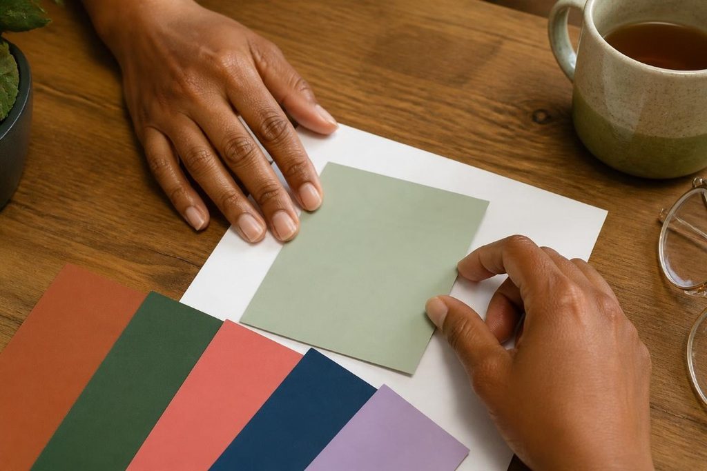
To see a color’s undertone, hold the swatch against a plain sheet of white printer paper. Next to true white, a purple that leans blue or a green that leans yellow becomes obvious, which makes it much easier to tell whether a color will feel warm or chilly in your room.
Start With the Feeling You Want, Then Choose the Colors
Before choosing a single swatch, decide how you want the room to feel. A bedroom you want to feel restful calls for a different palette than a dining room you want to feel lively, even though both can be completely hygge.
How do I choose a color palette if I’m afraid of color?
Start with a color you already love and keep reaching for, whether it shows up in your closet, your artwork, or objects you have kept for years. Introduce it through small, easy-to-change pieces like pillows, a throw, or a lampshade, live with it for a few weeks, and build from there once it starts to feel like yours.
I understand the fear completely. Color feels like a commitment, and it is easy to worry that a room will look childish, dated, or overwhelming. What helped me was realizing that the colors I already gravitated toward were telling me something. Purple kept showing up in what I loved, so that became my starting point rather than whatever palette was trending.
Tasteful color is less about which color you choose and more about how you use it. A room with one well-chosen lead color, a supporting color, and plenty of breathing room almost always feels more polished than a room with six colors fighting for attention. Confidence grows quickly once you see that working in your own space.
It also helps to think about when you actually use each room. Many of us spend the most time in our living rooms and bedrooms in the evening, so a palette that looks wonderful at noon but cold under lamplight is not doing its job.
Questions to Ask Yourself
- How do I want this room to feel at 8 p.m. on a quiet evening?
- Which colors keep appearing in the clothes, art, and objects I love?
- How much natural light does this room get, and which direction do the windows face?
- What is staying no matter what, like flooring, cabinets, a sofa, or a fireplace surround?
- Who uses this room, and what do they do in it?
Homey Hygge Recommendation
Build a palette from things you already own before you buy anything. Gather a favorite pillow, a book cover, a scarf, a mug, or a piece of art, set them together in the room you are decorating, and notice which combinations make you happiest. That little collection is often a more honest starting point than any paint fan deck.
Plum and Warm Ivory
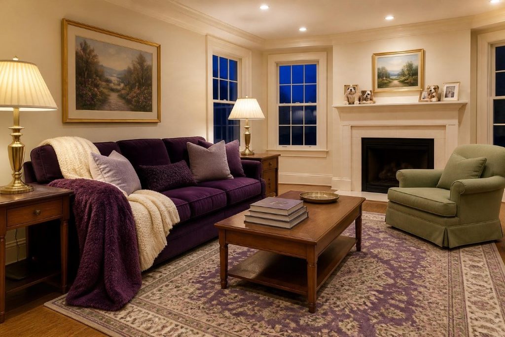
Plum paired with warm ivory is one of the coziest ways to bring real color into a hygge home. The plum adds depth and richness, while the ivory keeps the room bright and gives your eye a soft place to rest.
Is purple a cozy color for a home?
Yes, especially purples with a little red or brown in them, such as plum, aubergine, and mulberry. These warmer purples feel enveloping and sophisticated, while cooler blue-violets read crisper, so a warm purple is the easiest place to start if coziness is the goal.
This is my palette, so I will admit some bias. If you remember the rich plum and mulberry rooms of 1990s home magazines, this palette has that same established, comfortable feeling without looking like a time capsule. It works because plum is deep enough to feel grounding, while ivory keeps the whole room from feeling heavy.
Plum looks especially beautiful on upholstery, bedding, curtains, and rugs, where texture deepens the color. Ivory works well on walls and trim, while a darker aubergine can add weight in small doses, such as a lamp base, a picture frame, or a patterned pillow. Brass or aged gold finishes bring out plum’s warmth.
You do not have to paint a single wall purple to use this palette. A plum velvet chair or a plum quilt against ivory walls can carry the entire look.
If you like this idea for your bedroom and are looking for more hygge bedroom ideas, checkout our guide, Hygge Bedroom Ideas.
Palette Breakdown
- Lead (about 60%): Warm Ivory, sample hex #FAF6F0, on walls, trim, and large neutral pieces.
- Supporting (about 30%): Rich Plum, sample hex #744080, on upholstery, bedding, curtains, or a rug.
- Accents (about 10%): Soft Lavender (#EFE4F3) and Deep Aubergine (#38233F), plus brass or aged gold.
- Pairs well with: medium-tone wood, sage green, cream knits, and gilded frames.
Homey Hygge Tip
If you are nervous about plum, start with one velvet pillow or a plum throw on a sofa you already own. Velvet makes plum look especially rich because its soft pile catches the light, so a single piece can tell you quickly whether this palette feels like home.
Lavender and Sage
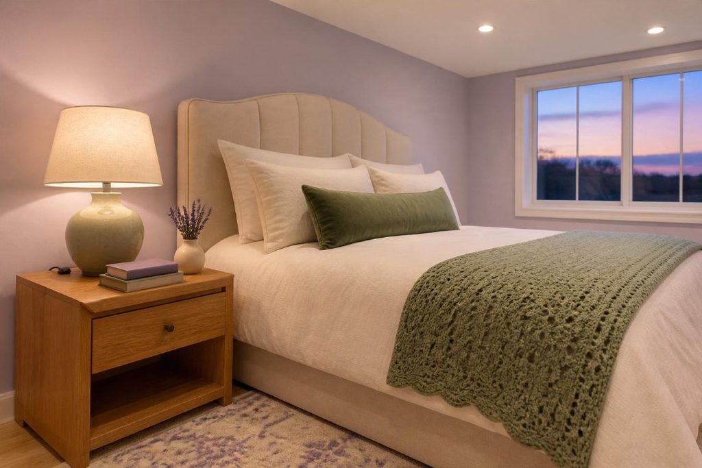
Lavender and sage create a soft, colorful palette that feels calm without falling back on beige. Both colors are gentle, so the room feels restful, yet together they still feel fresh and personal.
Does lavender look cold in a room?
It can if the lavender leans blue and the room gets cool northern light. Choose a lavender with a touch of pink or warm gray, and pair it with warm white bulbs, ivory, and wood tones to keep it feeling cozy.
This pairing shows up in nature, where lavender blooms sit above soft gray-green leaves, which may be part of why it feels so easy on the eyes. It is a lovely choice for bedrooms, reading corners, bathrooms, and any room where you want color that whispers rather than shouts.
Because both colors are light to medium in depth, this palette needs something to anchor it. Warm wood, a deeper plum accent, or a darker sage on a piece of furniture keeps the room from looking washed out. Texture helps as well, since chunky knits, linen, and crochet throws give soft colors more dimension.
This is also a gentle introduction to color for anyone who has been living with neutrals. Lavender walls with ivory bedding and sage accents still feel calm, but the room no longer looks like it could belong to anyone.
Palette Breakdown
- Lead (about 60%): a soft lavender, sample hex #DCCDE3, on walls or bedding.
- Supporting (about 30%): Fresh Sage, sample hex #7FA06B, on textiles, a painted dresser, or cabinetry.
- Accents (about 10%): Warm Ivory (#FAF6F0) and a plum accent (#744080).
- Pairs well with: light to medium oak, crochet and knit textures, and simple seasonal flowers.
Homey Hygge Tip
Introduce sage through textiles before paint. Greens shift a lot in different lighting, so look at a sage pillow or throw next to your lavender in the evening with the lamps on before committing to a larger sage piece.
Berry and Coral Rose
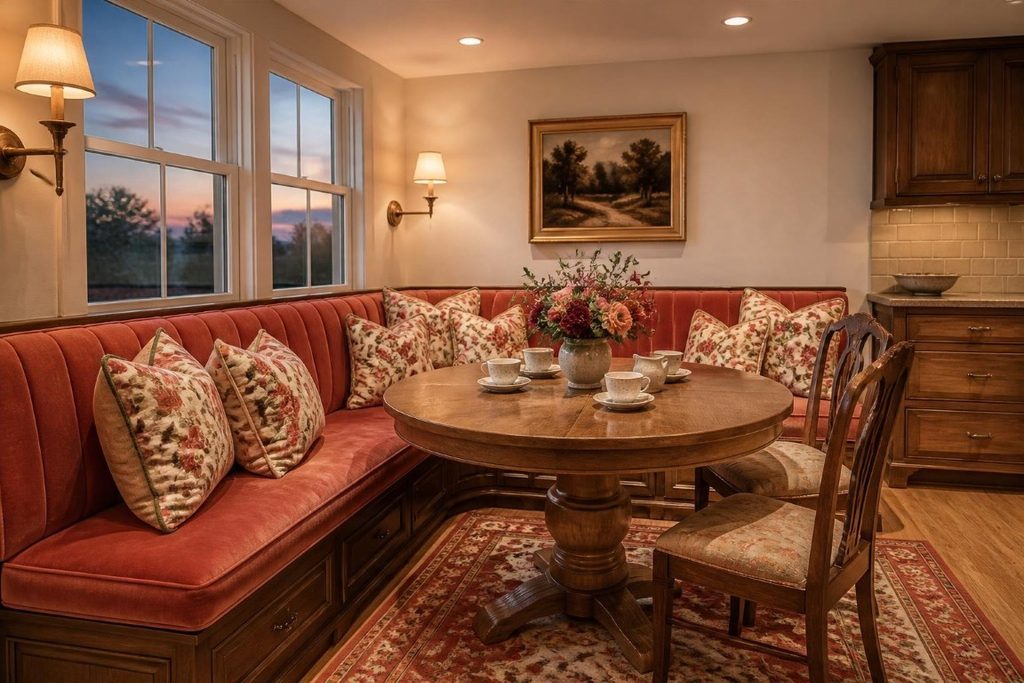
Berry tones paired with warm coral rose bring cheerful, welcoming warmth to a room, and they shine in spaces where people gather. Grounded with ivory and wood, this palette feels grown-up rather than sugary.
How do I use pink in a mature, grown-up way?
Choose deeper or dustier versions, such as berry, raspberry, coral rose, or terracotta pink, rather than bubblegum. Then pair them with grounding colors like aubergine, deep green, or warm wood, and use rich textures like velvet or linen.
Berry and coral rose have a warmth that makes a room feel instantly friendly. They work beautifully in dining rooms, breakfast nooks, and living rooms where conversation and comfort matter more than quiet. The deeper berry gives the palette its backbone, while coral rose keeps it soft and inviting.
This is a palette that loves pattern. Florals, ikats, and traditional rugs often combine berry, coral, and green naturally, which saves you the work of coordinating colors piece by piece. A patterned rug or upholstered chair can become the anchor, with solid colors pulled from it for pillows and curtains.
Keep the walls calm if your textiles are doing the talking. Ivory or a very soft blush lets the pattern take center stage without making the room feel busy.
Palette Breakdown
- Lead (about 60%): Warm Ivory, sample hex #FAF6F0, or a soft blush on walls.
- Supporting (about 30%): Warm Coral Rose, sample hex #C86F6A, on upholstery, curtains, or a rug.
- Accents (about 10%): a deep berry (#8C2F5A) and Fresh Sage (#7FA06B).
- Pairs well with: warm wood, brass, floral prints, and velvet.
Homey Hygge Recommendation
Let a pattern you love choose your palette for you. Find a rug, fabric, or piece of art that already combines berry, coral, and a touch of green, then pull your solid colors directly from it. The colors are already proven to work together, so the room feels coordinated without looking matched.
If you’re looking for more tips and ideas for creating your hygge living room setup, checkout our guide here.
Terracotta and Gold
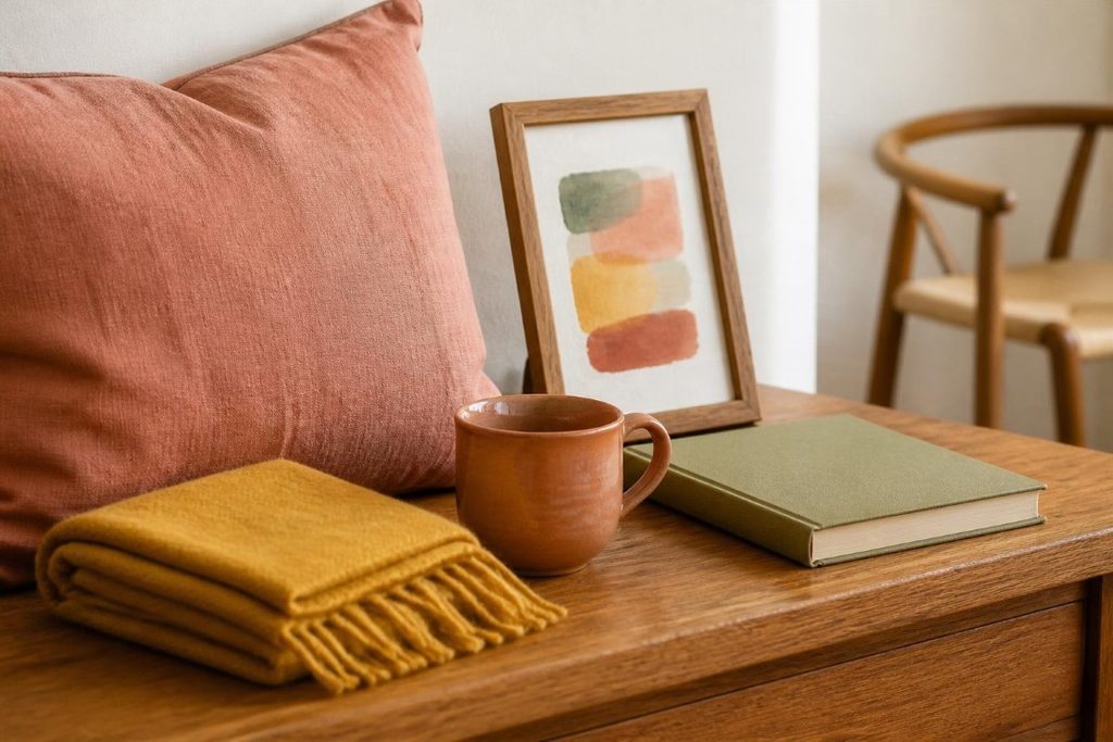
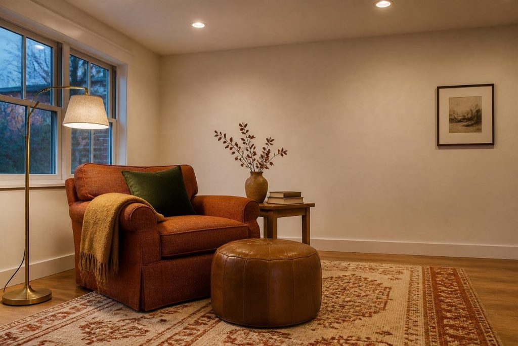
Terracotta and golden ochre make one of the warmest palettes you can choose, with an earthy glow that feels especially good in fall and winter. Cream keeps the room bright, while a touch of deep green or plum keeps it from feeling one-note.
What colors go well with terracotta?
Cream, warm whites, ochre, mustard, olive and sage greens, deep blues, and plum all pair beautifully with terracotta. Natural materials such as wood, leather, rattan, and brass make it look even richer.
Terracotta has the warmth of clay and sun-baked earth, which makes it naturally inviting. Golden ochre adds a soft glow, and together they create a room that feels warm even before the lamps come on. This palette suits living rooms, kitchens, and dens where you want a relaxed, gathered-around feeling.
The risk with this palette is letting orange take over. Use terracotta in measured doses, such as one upholstered piece, a rug, and a few accessories, and let cream do most of the work on the walls. A contrasting accent like deep green or plum keeps everything balanced and a little more unexpected.
This palette also adapts easily through the seasons. Lean into rust and ochre textiles in fall, then lighten the look with more cream and sage in spring without changing anything permanent.
Palette Breakdown
- Lead (about 60%): Cream, sample hex #F3E9D8, on walls and large pieces.
- Supporting (about 30%): Terracotta, sample hex #B5634B, on a sofa, chair, rug, or curtains.
- Accents (about 10%): golden ochre (#C9A04A) with deep green or plum.
- Pairs well with: medium wood, leather, earthenware, and aged brass.
Homey Hygge Tip
Try terracotta in a lampshade or a lamp base before committing to paint. A colored fabric shade tints the light that passes through it, so check it in the evening, when you will see whether it adds a warm, inviting glow or simply too much orange.
Forest Green and Warm Wood
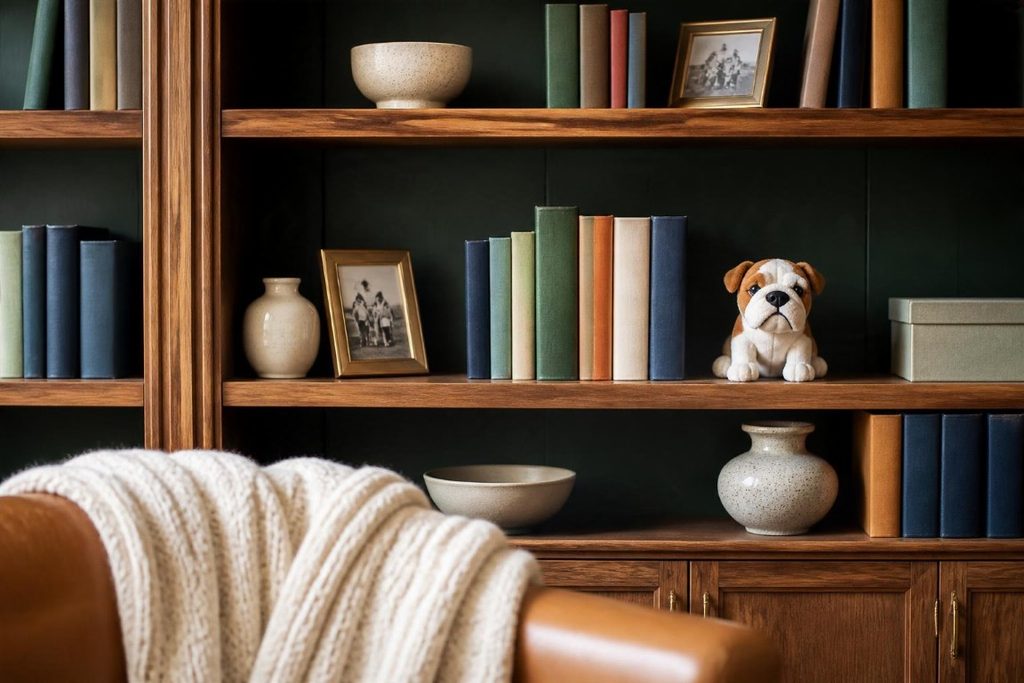
Deep forest green paired with warm wood and cream creates a grounded, library-like palette that feels established and calm. It is a natural choice for living rooms, dens, home offices, and reading corners.
Can dark colors make a room feel cozy instead of small?
Yes. Dark colors absorb more light than they reflect, which can make a room feel enveloping and intimate rather than cramped. The key is giving them enough light and contrast, with cream, warm wood, and plenty of lamps keeping the room bright and welcoming.
Forest green has a way of making a room feel like it has been loved for years. Against warm wood, it brings out the richness of the grain, and brass or aged-gold accents catch the light beautifully. Shelves of books and framed art look especially at home here.
Paint companies describe how much light a color reflects with a number called light reflectance value, or LRV, measured from 0 to 100. Deep greens sit low on that scale, so they will look darker in a dim room and more vivid in a well-lit one. That does not mean you should avoid them, only that this palette needs a thoughtful lighting plan.
If a fully green room feels like too much, use green on cabinetry, built-ins, a single wall, or a velvet sofa. Cream walls with green upholstery give you the same grounded feeling with far less commitment.
Palette Breakdown
- Lead (about 60%): Cream, sample hex #F2EADB, or forest green on walls if you want a more dramatic room.
- Supporting (about 30%): Forest Green, sample hex #2F4A3A, on upholstery, built-ins, or cabinetry.
- Accents (about 10%): camel (#B88A5A) and brass, with a touch of plum or rust.
- Pairs well with: walnut and medium oak, leather, books, and plaid or tweed textiles.
Homey Hygge Tip
Paint the back of a bookcase or built-in deep green. It frames books and favorite objects beautifully, adds depth to the room, and lets you live with a dark color in a small, contained dose before deciding whether you want more.
Cozy Blue and Rust
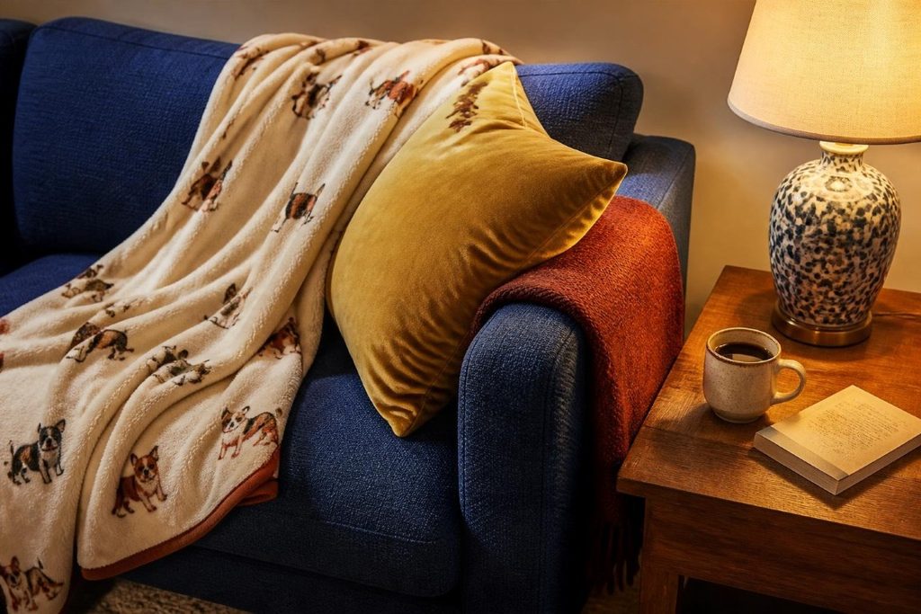
Blue can absolutely be hygge when you choose warmer, deeper, or grayed blues and pair them with rust, camel, or warm wood. Those warm partner colors are what keep blue feeling cozy instead of chilly.
Why does blue look cold in my room?
Cool colors tend to look colder in cool light, especially in north-facing rooms, where daylight leans blue. Warm white bulbs can soften a blue, but they can also mute it, so pairing blue with warm partners like rust, camel, and wood is usually the more reliable fix.
Blue is one of the most loved colors in home decorating, so it is worth knowing how to make it cozy. Deep navy, indigo, and slate blues feel calmer and richer than bright or icy blues. Paired with rust, they create a classic combination with plenty of warmth and contrast.
This palette works well in living rooms, bedrooms, and dens, and it has a slightly traditional feeling that suits layered, collected homes. Think of a navy sofa with a rust wool throw, blue-and-white ceramics on a shelf, and warm wood furniture tying everything together.
Avoid pairing blue with stark white and cool gray if coziness is your goal. Warm white, cream, and natural wood make a noticeable difference in how welcoming the room feels.
Palette Breakdown
- Lead (about 60%): Warm White, sample hex #F6F0E6, on walls.
- Supporting (about 30%): a deep cozy blue, sample hex #2E4057, on upholstery, curtains, or a rug.
- Accents (about 10%): rust (#A9532F) and mustard or gold (#C9A04A).
- Pairs well with: warm wood, wool, leather, and blue-and-white ceramics.
Homey Hygge Recommendation
Bring in rust through textiles, such as a wool throw, a quilt, or a patterned pillow. Textiles let you control exactly how much warmth the blue needs, and you can add more rust in winter and pull some back in summer.
Warm Neutrals and Wood
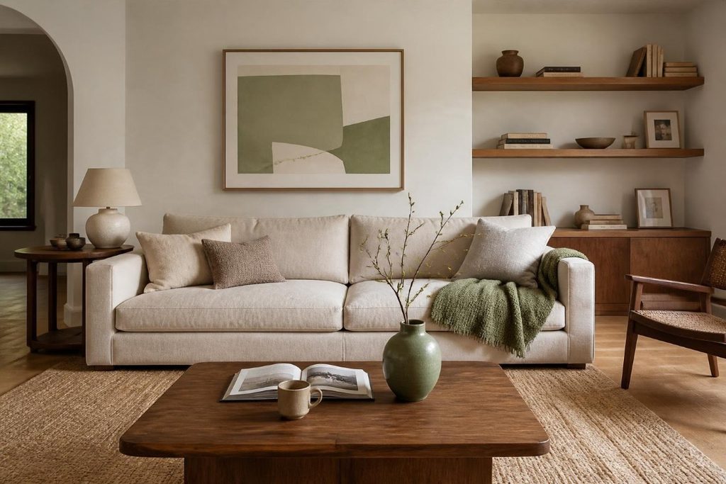
The classic hygge palette of creamy whites, oatmeal, mushroom, and natural wood is still a wonderful choice, especially when it feels warm and layered. Add at least one color that feels like you, and a neutral room becomes personal rather than plain.
How do I keep a neutral room from feeling boring?
Vary the texture and depth. Combine light and darker neutrals, mix materials like wool, linen, wood, and leather, and add personality through art, books, and a favorite accent color.
Homey Hygge is not anti-neutral. Plenty of cozy homes are built on cream, oatmeal, and wood, and this palette can feel calm, bright, and deeply comfortable. What it should not feel like is a showroom where nobody actually lives.
The difference comes down to warmth and layers. Creamy whites feel softer than stark ones, and several neutrals in different depths create interest without needing much color. Wood tones, from honey oak to walnut, add a natural warmth that cool grays simply cannot.
Then let your personality in. Books with colorful spines, family photographs, art, and a favorite blanket all count. Even one consistent accent color, repeated in a few places, can make a neutral room feel unmistakably yours.
Palette Breakdown
- Lead (about 60%): Warm White, sample hex #F7F1E6, on walls and large pieces.
- Supporting (about 30%): oatmeal (#DCCBB2) and mushroom (#A8957D) in textiles and upholstery.
- Accents (about 10%): one color you love, such as plum, sage, or coral rose, plus a darker wood.
- Pairs well with: linen, wool, chunky knits, leather, and natural fibers.
Homey Hygge Tip
If your home is mostly neutral right now, choose one accent color and repeat it in three small places, such as a throw, a piece of art, and a vase. It is the easiest way to see how a little color changes the feeling of a room without redecorating.
Use Color Without Overwhelming the Room
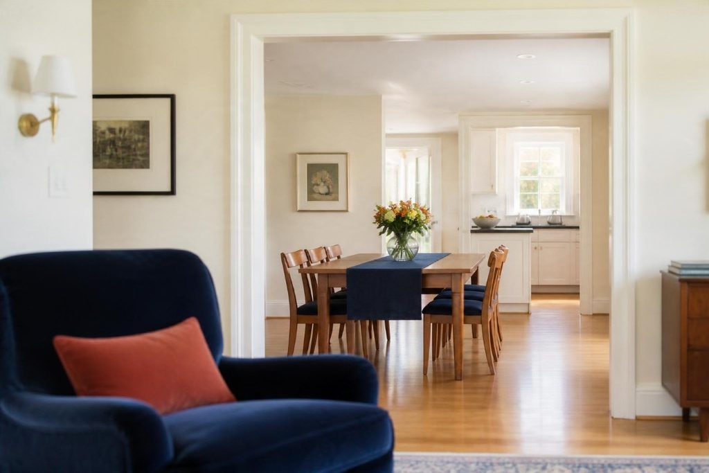
Give one color the lead, let a second color support it, and save the boldest shades for small accents. The classic 60-30-10 guideline is a helpful starting point for that balance, but it is a guide rather than a rule.
What is the 60-30-10 rule in decorating?
It is a long-standing proportion guideline: about 60 percent of a room in a dominant color, 30 percent in a secondary color, and 10 percent in an accent. The dominant color usually covers walls, large rugs, or big furniture, the secondary shows up in upholstery, curtains, and bedding, and the accent appears in pillows, art, and accessories.
This is where tasteful color really happens. A room can hold a surprising amount of color when the proportions feel intentional, and very little color can still look chaotic when everything has equal weight. The 60-30-10 guideline simply gives your eye a clear order to follow.
Your dominant color does not have to be neutral. A room can be 60 percent lavender or deep green and still feel calm, as long as the supporting and accent colors are chosen with care. Several shades of one color can also count as a single color, so plum, lavender, and aubergine together read as one family rather than three competing hues.
Remember that cozy does not mean cluttered. Color looks its best when it has some breathing room, so a few well-placed colorful pieces will feel more polished than a colorful object on every surface.
Balance Checks
- One clear lead: if you cannot tell which color is in charge, the room will likely feel busy.
- Repeat, do not scatter: a color that appears in a few places looks intentional, while a color that appears once can look accidental.
- Mix depths: combine light, medium, and dark shades so the room has contrast and dimension.
- Count wood and metal: warm wood, brass, and black iron all act as colors in a room.
- Leave some calm: plain walls, solid textiles, and open surfaces give colorful pieces room to shine.
Homey Hygge Recommendation
Carry one color from room to room, even if each room has its own palette. A shared ivory, a recurring plum, or the same wood tone helps the whole home feel connected, so walking from the living room to the kitchen feels like one story rather than several.
Let Your Lighting Work With Your Colors
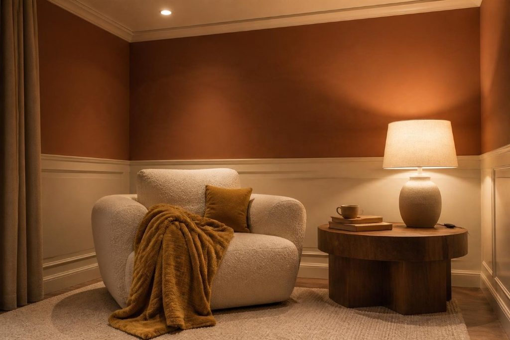
Light changes how every color looks. Warm white bulbs, roughly 2700K to 3000K, make warm colors glow and soften cool ones, while daylight bulbs and north-facing windows push colors cooler and crisper.
What light bulb color temperature is best for cozy colors?
Warm white bulbs in the 2700K to 3000K range suit most cozy palettes, because they enhance the warmth in colors like plum, berry, and terracotta. If a cooler color such as blue or lavender looks muddy under very warm light, try a bulb closer to 3000K or 3500K.
If you have ever loved a paint chip in the store and been surprised by it on your wall, lighting is often the reason. Stores commonly use cooler, brighter light than most homes, and the direction of your windows matters too. North-facing light tends to be cooler and bluer, while south-facing light tends to be warmer and more golden.
In our home, the lighting I rely on most in the evenings is a mix of lamps with built-in dimmers and color-adjustable smart bulbs on larger side tables and nightstands, along with recessed lights overhead. During the day, I love natural sunlight, so the lamps mostly come on as evening settles in. Adjustable bulbs are also a handy way to see how a color shifts as the light warms or cools.
Depth plays a role as well. Lighter colors with a higher LRV bounce more light around a room, which is helpful in spaces with limited daylight. Deep colors can still work beautifully in darker rooms, but they need more lamps to look rich instead of gloomy.
Lighting and Color Pairings
- Warm palettes (plum, berry, terracotta, ochre): warm white bulbs around 2700K to 3000K bring out their richness.
- Cool-leaning colors (blue, lavender, some greens): warm bulbs soften them, but very warm light can make them look muddy, so test around 3000K.
- North-facing rooms: lean toward warmer colors and warm bulbs to offset cooler daylight.
- South-facing rooms: these can comfortably handle cooler colors because the daylight adds its own warmth.
- Deep, dark colors: plan for several lamps at different heights so the color reads rich rather than dark.
For a deeper look at layering lamps and choosing bulbs, see our guide to Hygge Lighting: How to Create a Warm, Cozy Glow at Home.
Homey Hygge Tip
Check every paint sample at night with your lamps on, not only in daylight. Many of us use our living rooms and bedrooms most in the evening, so the color you see at 8 p.m. is the one you will live with most.
Test Your Colors Before You Commit
Test every color in your own room, on more than one wall, in both daylight and evening light, before buying gallons of paint. If you are nervous about color, start with small, changeable pieces and build up from there.
How should I test paint colors at home?
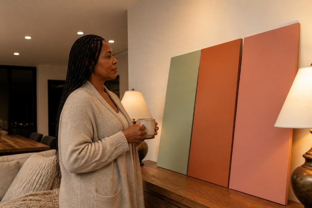
Use large samples rather than small chips, either painted directly on the wall or on sample boards you can move around. Look at them on different walls, at different times of day, and next to the flooring, furniture, and textiles that are staying in the room.
This step is where the fear of color starts to fade. When you can see a color in your own room, next to your own sofa, under your own lamps, the decision becomes much less intimidating. You stop guessing and start reacting to what is actually in front of you.
Painted sample boards are especially useful because you can move them from wall to wall and room to room. A color can look completely different beside a window than it does in a shadowed corner, and seeing both helps you avoid surprises.
If paint still feels like too big a step, start with textiles and accessories. Those let you live with a palette for a while, and they are easy to swap if something does not feel right.
Easy Ways to Try Color First
- A large throw or blanket on the sofa or bed
- Pillow covers in your lead and accent colors
- A colored lampshade or lamp base
- A piece of art that features your palette
- A painted side table, dresser, or picture frame
- The back of a bookcase or the inside of a cabinet
- One accent wall in a room you use often
Homey Hygge Tip
Once your samples are up, live with them for at least a few days before deciding. Notice which color you find yourself smiling at when you walk into the room, because that reaction is usually more reliable than any rule.
Frequently Asked Questions About The Best Hygge Color Palettes
What are the best colors for a hygge home?
The best hygge colors are the ones that feel warm, comfortable, and personal to you. Warm neutrals are a classic choice, but rich plum, soft lavender, sage, berry, terracotta, forest green, and deep blues can all feel cozy when they have warm or softened undertones and are used in balanced proportions.
Can a purple room be hygge?
Absolutely. Warm purples like plum, aubergine, and mulberry feel rich and enveloping, and lavender can feel soft and calm. Pair purple with ivory, warm wood, and warm lighting to keep it cozy and grown-up.
What colors should I avoid in a cozy room?
No color is off-limits, but some versions are harder to make cozy. Neon brights, stark bright whites, and icy cool grays can feel energetic or cold, especially under cool lighting. Softer, warmer versions of the same colors are usually easier to live with.
Is gray a hygge color?
Warm grays and greige can feel very cozy, especially paired with wood and soft textiles. Cool, blue-leaning grays can feel chilly, so if you love gray, look for versions with a little warmth in them.
How many colors should a hygge room have?
Most rooms feel balanced with three main colors, a lead, a supporting color, and an accent, plus natural wood and metal finishes. You can use several shades within each color family, which adds depth without making the room feel busy.
Should every room in my home use the same color palette?
Not necessarily. Each room can have its own palette, but repeating one color, neutral, or wood tone throughout the house helps everything feel connected and intentional.
Choose the Colors That Feel Like Home
The best hygge color palette is not the one a trend report picks for you. It is the one that makes you exhale a little when you walk into the room. For me, that means letting purple take the lead, and for you, it might mean sage, berry, deep green, or a warm cream with one beloved accent color.
Color does not have to be loud to be brave, and it does not have to be beige to be cozy. Choose colors you love, give them room to breathe, light them warmly, and let your home look like the people who live there. That is what makes a space feel cozy, colorful, and beautifully lived.
Continue Creating Your Homey Hygge Home
Color and light work hand in hand, so the next step is making sure your lighting brings out the best in your palette. Read Hygge Lighting: How to Create a Warm, Cozy Glow at Home to learn how to layer lamps, choose warm bulbs, and make every color in your home glow.